Monday, April 30, 2012

Room Revamp

We had a busy weekend finishing up my daughter's bedroom. I promised her a while back we would rip out the ugly wall to wall carpet and put in wood floors. Have I ever mentioned I HATE carpet?! Nasty stuff...even though the room was regularly vacuumed, we had dust and dirt piles everywhere.

Morgan is an artist and her bedroom is her canvas. She has done a wonderful job putting her personal stamp on the room. So she was up to doing a little experiment on the flooring. Frugal Farmhouse Design had a "how to" post on installing plywood plank flooring. This is an inexpensive, easy way to get  the look of old worn wood floors.


We moved the furniture as we layed the floor...


after ripping out the carpet, we had to remove hundreds of staples...


The room is almost done and we'll have an entire room reveal next post.

Thursday, April 26, 2012

Apartment Therapy Home Tour

I regularly check out the house tours on Apartment Therapy (it's not just apartments) and every once in a while I find a home that absolutely WOWS me.
The home of lighting designer Marjorie Skouras is so full of wonderful details, unexpected color combinations and some of the most creative lighting ideas I've ever seen that I find I have become a bit obsessed. This home may be a bit "over the top" for some people, but it is fun to look around and I think everyone can find some inspiration in the creative vignettes Marjorie has created.


Look at that front door design!


Check out Marjorie Skouras home tour to see more images.

Tuesday, April 24, 2012

Dining Room Update

I finished upholstering my wrought iron chairs and now they look like they belong in my dining room...


Remember the "before" pictures, they looked like they belonged more out in the garden.


Now my dining room has that "vintage eclectic" look I strive for.

Sunday, April 22, 2012

Kim Parker

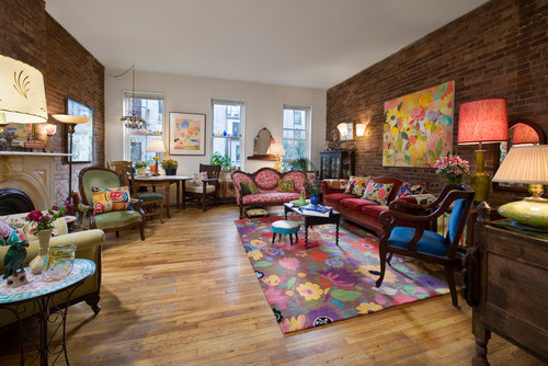
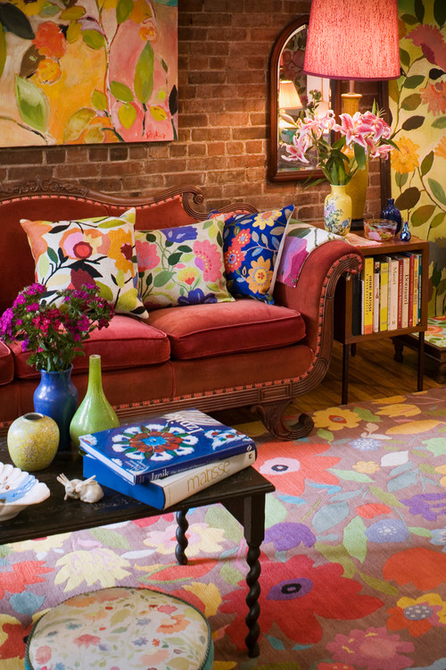
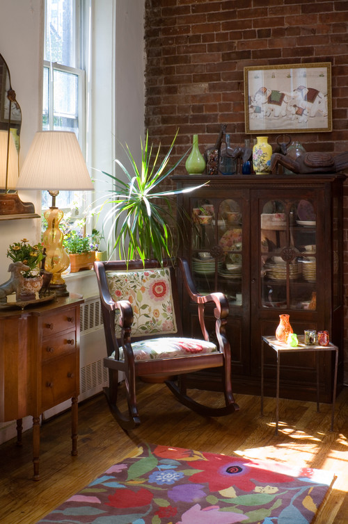
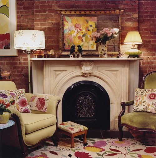
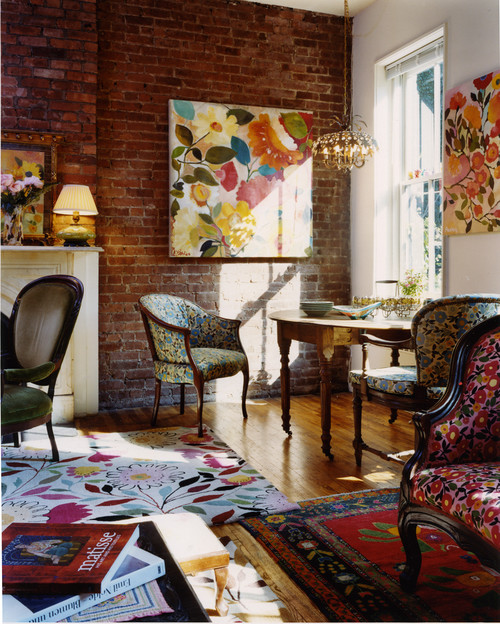
Kim Parker is an internationally acclaimed artist, award-winning textile designer and author. The room below features her signature floral design style, full of bright colors and an eclectic assortment of furnishings. 

Kim Parker Interiors Designer Showcase Space02 eclectic living room

Kim Parker Interiors Designer Showcase Space 05 eclectic living room

Kim Parker Interiors Designer Showcase Space 06  living room

Kim Parker Interiors Designer Showcase Space 04 eclectic living room

Kim Parker Interiors Designer Showcase Space 03 eclectic living room

Images from Houzz

Thursday, April 19, 2012

Vintage Metal Porch Glider

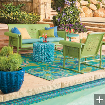
Last year about this time I did a post on Vintage Gliders and to tell you the truth I haven't even thought about outside projects because I've been so busy with inside projects. That is until this flyer came in the mail...


Grandin Road has reproduction gliders for sale in blue, red, green or white. I still love the "real vintage" gliders, but it's nice to know there is place to find the "next best thing".


Tuesday, April 17, 2012

Kishani Perera

"From the finest showrooms in Paris to the hidden gems of eBay, Interior Designer Kishani Perera relies on a multitude of resources to create beautiful spaces that have seemingly evolved over decades rather than months. This ability to blend the reclaimed with refined, the ordinary with ornamental, has attracted a loyal following who have come to depend on her imagination and inventive use of resources to cultivate homes that are both chic and livable"


I just purchased her new design book Vintage Remix

If you love vintage eclectic design then check this book out, it's filled with vintage lighting, retro accessories and a colorful assortment of furnishings from all eras.
Kishani Perera also has a boutique in LA, CA "Rummage"

Sunday, April 15, 2012

Finishing up Projects

I finished up a couple of projects for my shop. These vintage metal chairs just needed new seats, an easy project that took me way too much time to complete.


This table is my first "white" painted piece. I love color and find white a little boring, but I wanted to show off the great rusted metal feet with the crystal balls. The color is actually "Linen" and I love it.... I think I'll be painting a few more pieces with it.


Friday, April 13, 2012

"New" Kitchen for 18th Century House

My favorite kitchens are a mix of traditional and contemporary elements. I want the best and newest appliances I can afford, but I love the warmth that old floors, ceilings, furniture and accessories add to the room.


This Pennsylvania home was built in 1765. The homeowners wanted an updated kitchen that would fit into their antique home.


(Images: Old House Online )

I think the results are beautiful.
Related Posts Plugin for WordPress, Blogger...

Blog Top Sites